

Data Storytelling · Power BI · Frontier AI
Turning data into better decisions.With AI and frontier models.
Sometimes the problem isn’t where you think it is.
That’s why I bring the data together. A useful visualization does more than show a number. It helps people see a relationship, question an assumption, or understand why work isn’t moving.
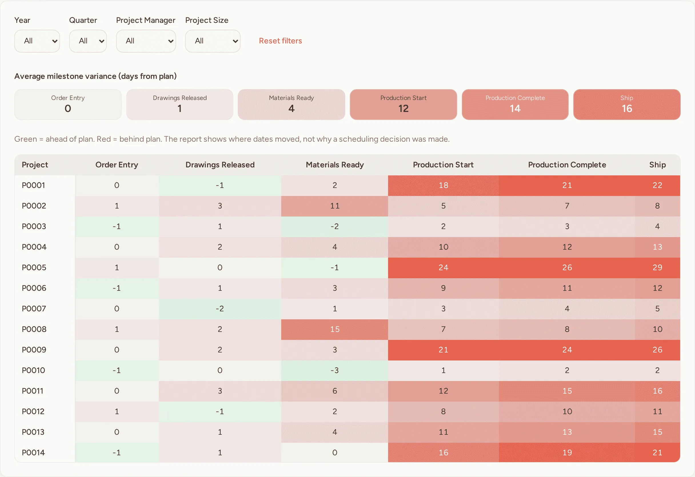
Long-lead materials weren’t the whole problem
What people thought: Long-lead materials were causing the late shipments.
What the report showed: Many smaller jobs had materials ready, then waited longer to start production.
What it helped them review: Review how smaller jobs enter the schedule and set delivery dates from the production plan.
Representative scenario with synthetic project names, dates, and figures.
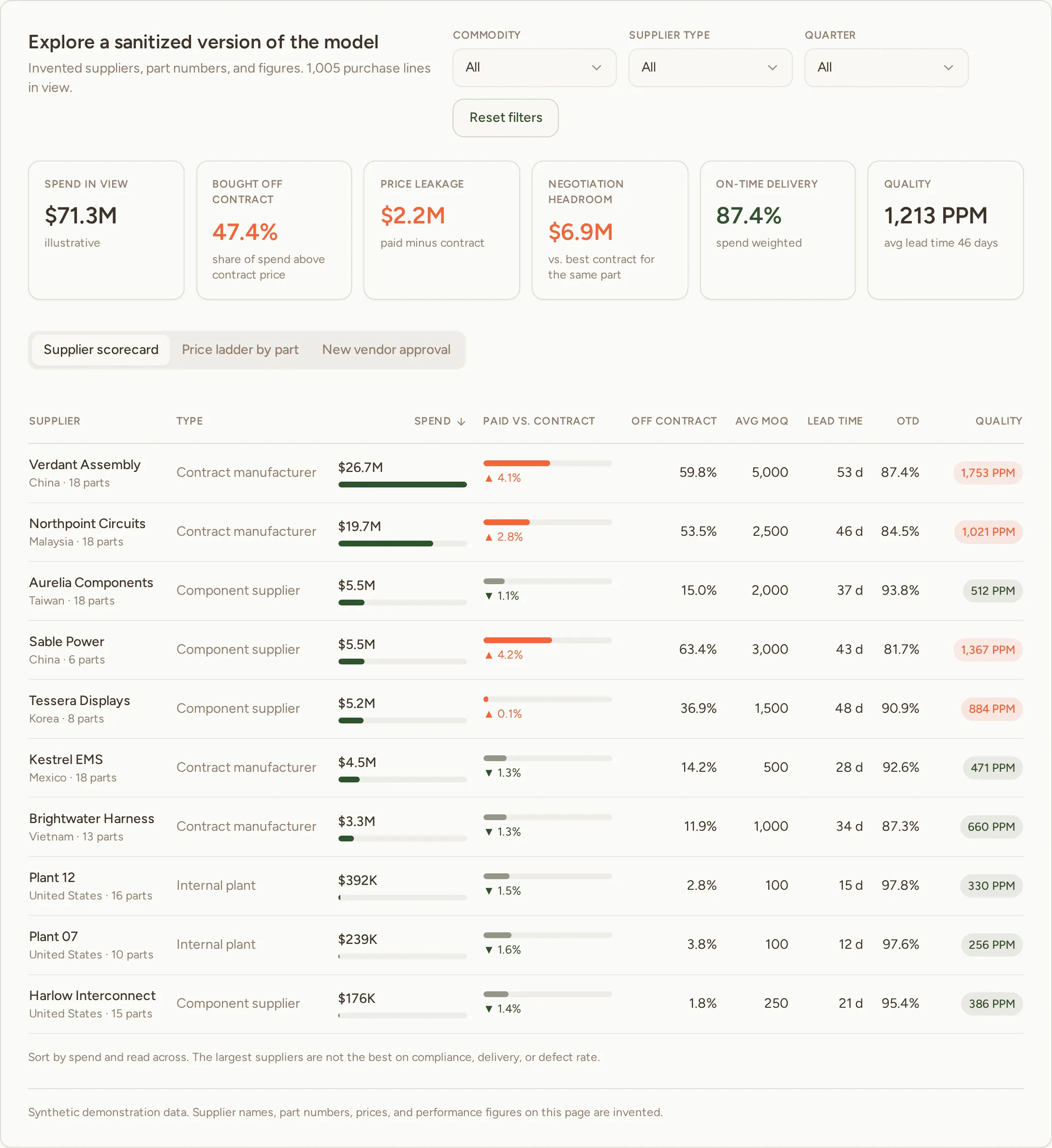
Three prices for the same part, and nobody could see it
What people thought: Each supplier spreadsheet gave buyers a different view of the same parts.
What the report showed: A single part master put contract price, paid price, delivery, and quality on one record.
What it helped them review: Compare suppliers with the full history in view before deciding where to move volume.
Illustrative supplier names, part numbers, and figures.
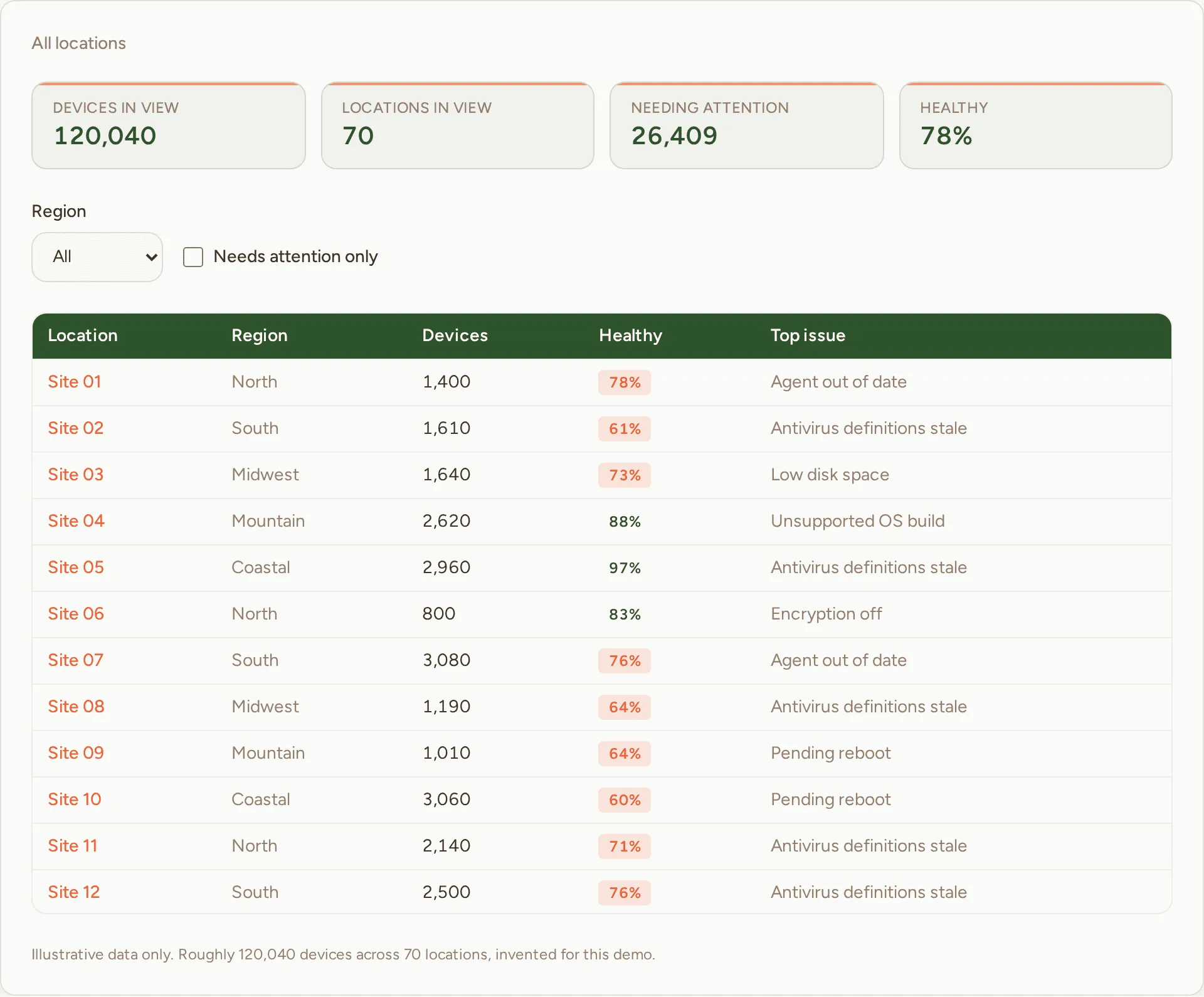
One clear picture of 120,000 devices across 70 locations
A flat file of PC status data, rebuilt as a star schema. Leadership went from company wide trends down to a single location's top IT issue in seconds.
Representative demonstration with synthetic data.
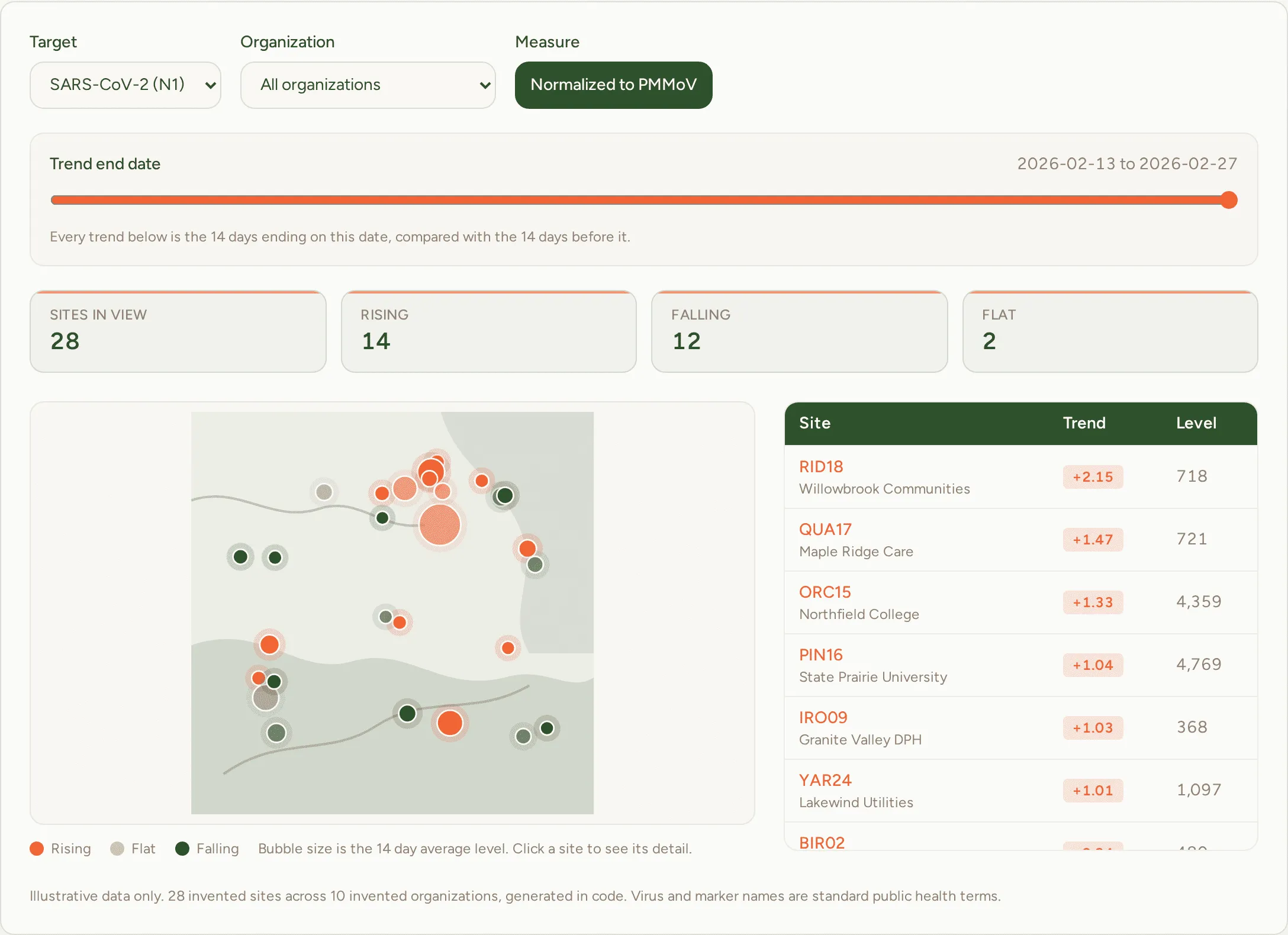
Seeing an outbreak in the sewer before it hits the clinic
Virus counts in wastewater move with the weather, not just with illness. Normalizing against PMMoV and adding a 14 day trend turned the file into a map people could act on.
Representative demonstration with synthetic data.
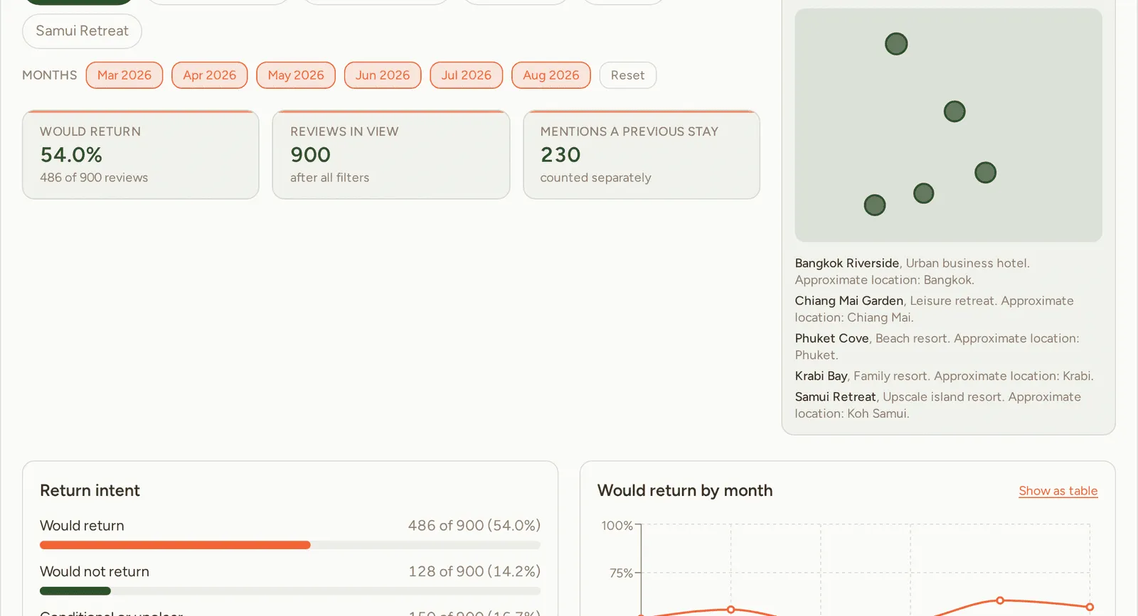
Guest satisfaction is a score. Returning is a decision.
A fictional hotel group, 900 invented reviews, and a working demo that separates a good rating from a guest actually saying they will come back.
Fictional demonstration with synthetic data.
How I help
Start with the question.
Business intelligence
Power BI models and reports built around the decision you need to make.
Learn moreAI training and services
Practical AI your team can use on real work and check with confidence.
Learn moreSpeaking and workshops
Talks for conferences, universities, Rotary, and teams on how AI changes work.
Learn moreOrganizations I've worked with